
Call : 0485800108 Email: contact@BerryBrush.com.au

Country homes have a look and feel that’s completely their own — and the right paint colours are a big part of why. The wrong choice and a beautiful old weatherboard cottage can look like it belongs in a suburban street. Get it right, and the home settles into its surroundings in a way that feels effortless.
Whether you’re repainting an older Berry property, refreshing a rural home in the Kangaroo Valley hinterland, or updating a coastal cottage near Jervis Bay — here’s how to think about colour for a country-style home.
Why Country Homes Need a Different Approach to Colour
Suburban and city homes are usually surrounded by other buildings, paved surfaces, and manufactured landscapes. Country and rural homes sit in a completely different context:
- Surrounded by native vegetation, pasture, or bush
- Often with corrugated iron roofing, timber detailing, or heritage features
- Exposed to strong natural light that reads differently from urban light
- Viewed from a distance, not just from the footpath
A colour that looks clean and modern on a rendered Sydney terrace can look jarring and out of place on a weatherboard farmhouse in the Shoalhaven hinterland. The surroundings matter — and the best country colour schemes respond to the landscape rather than fight it.
The Core Principle: Work With the Landscape
In country settings, the most successful exterior colour schemes share one quality: they feel like they belong. That usually means:
- Muted, low-saturation tones rather than bright or pure colours
- Warm neutrals and earthy tones that echo the landscape
- Colours that complement the roof, surrounding vegetation, and any exposed timber or stonework
- Heritage-leaning palettes for older homes — these were usually designed to blend with their surroundings from the start
Bright white, vivid grey, or sharp contemporary charcoal can work on country homes — but they need careful handling, and they don’t suit every style or setting.
Exterior Colour Palettes That Work for Country-Style Homes
Warm Earthy Tones
This is the go-to palette for rural NSW properties. Think ochres, olive-adjacent greens, warm buff, and dusty terracotta. These tones reflect the colours already present in the landscape — dry grass, bark, sandstone, soil.
Good picks:
- Dulux Weathered Sandstone — a warm buff with excellent versatility
- Haymes Red Gum — a rich, muted earthy brown
- Taubmans Outback Mud — deep and warm without being heavy
Heritage Greens and Slate Blues
Classic Australian Federation and Victorian-era homes — common in towns like Berry and Kiama with their heritage streetscapes — often suit dark greens, slate blues, and deep charcoals paired with cream or white trim.
Good picks:
- Dulux Wilderness — a muted blue-green that suits timber homes perfectly
- Haymes Bottle Green — deeper, works beautifully with cream trim
- Taubmans Slate — a sophisticated mid-dark tone that’s neither too grey nor too blue
Soft Whites and Creams
There’s nothing wrong with a well-done white or cream on a country home — especially as the main body colour with contrasting trim. The key is to avoid stark bright whites, which look clinical against natural surroundings.
Good picks:
- Dulux Natural White — warm-leaning, never cold
- Haymes Cream of the Crop — a soft, biscuit-warm cream
- Taubmans Antique White USA — a classic warm white that’s been popular in regional NSW forever
Trim, Fascias, and Accents
Trim colours make or break a country scheme. The most common approach:
- White or off-white trim on a mid-toned body colour — classic, always works
- Dark trim on a light body — creates definition and a slightly more contemporary feel
- Matching or tonal trim on earthy body colours — more relaxed and cohesive
For corrugated iron features (verandah roofing, sheds, outbuildings), look at how the colour reads against your main palette. Matching iron to the roof or trim colour creates cohesion.
For timber detailing — verandah posts, window frames, balustrading — consider whether you’re highlighting the timber (use a contrasting colour) or integrating it (use a tonal match).
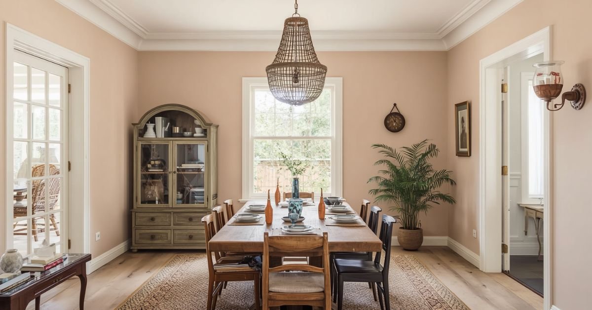
Interior Colour for Country Homes
Inside a country-style home, the same principles apply — but you have more room to bring in warmer, cosier tones that suit the character of the space.
Walls and Living Areas
- Warm whites with a hint of yellow or beige — Dulux Antique White USA or Haymes Ivory Silk work in almost any room
- Soft sage and olive greens — increasingly popular for kitchens, living rooms, and bedrooms in country homes
- Warm greiges — the in-between territory between grey and beige that reads neutral without feeling cold
Bedrooms
Bedrooms in country homes often have lower ceilings, timber floors, and lots of character. Colours that work well:
- Muted terracotta or dusty pink — warm and grounded without being too dominant
- Soft sage or eucalyptus green — calm, nature-inspired
- Warm off-white — always a safe choice that lets furniture and architecture do the talking
Kitchens
Country kitchens respond well to warm neutrals and soft greens. Semi-gloss on the walls is practical — easier to wipe down. Consider a slightly warmer tone in the kitchen than the living areas to make the space feel inviting.
Common Colour Mistakes on Country Homes
Choosing Colours That Are Too “Urban”
Sharp, cool greys and bright whites can look out of place in a rural or bush setting. They read as modern suburban rather than country. Test your shortlist in context before committing.
Not Testing in Natural Light
Country light is different from urban light — often brighter, with more sky visible. A colour that looks warm and soft inside a paint shop can look very different in full sun on an open rural site. Always patch-test on the actual wall.
Ignoring the Roof Colour
Your roof is fixed. Your garden, fencing, and surroundings are fixed. Your paint colour needs to work with all of those. Terracotta tiles, grey Colorbond, and green corrugated iron all push the palette in different directions.
Ready to Refresh Your Country Home?
At Berry Brush, we know regional NSW homes — the character, the timber, the conditions, and what colours and products hold up out here. We can help you think through colour choices and get the job done properly.
We service Berry, the Shoalhaven, Kangaroo Valley, and the South Coast broadly.